
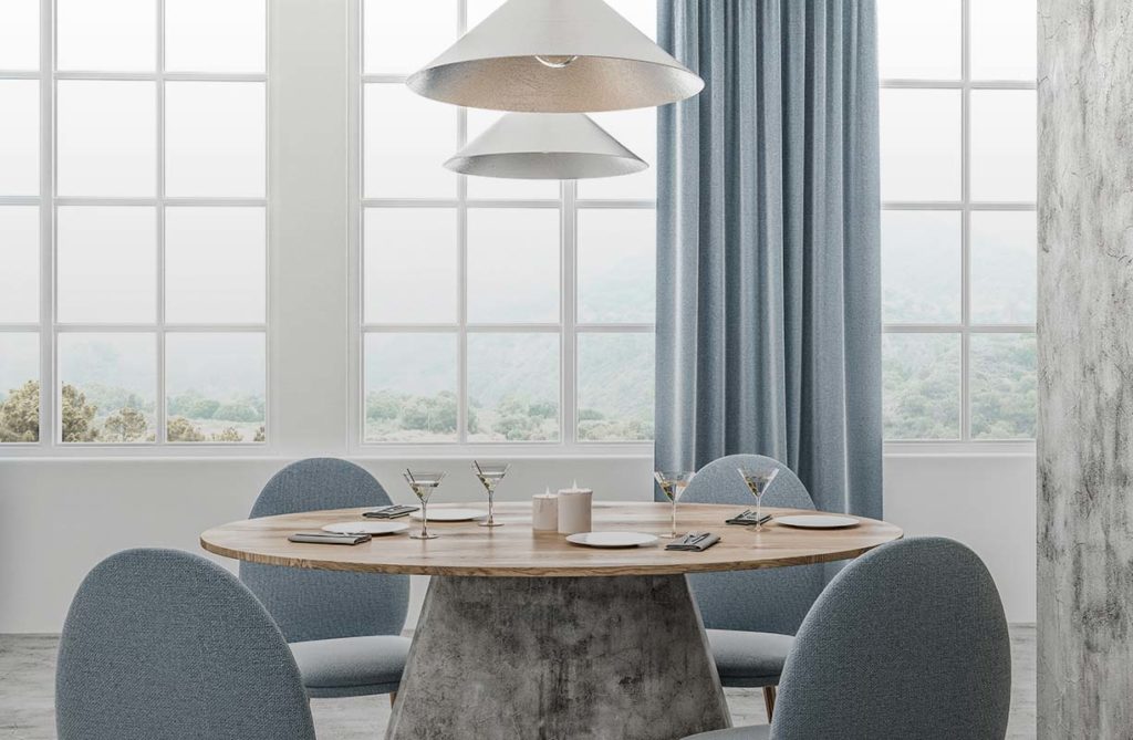
Colour is one of the most powerful tools in interior design, and understanding it starts with a simple distinction: warm colours and cool colours. Warm colours such as red, orange and yellow remind us of warmth and sunshine, and tend to evoke energy and excitement. Cool colours, like blue, green and purple, are calming and tranquil, reminiscent of water or a peaceful sky. But the part most people miss, the part that explains why a paint colour can look perfect on the swatch and wrong on the wall, is undertones. Once you understand undertones, choosing colour stops being guesswork.
Warm colours such as red, orange and yellow suit social spaces like kitchens and living rooms, while cool colours such as blue and green suit bedrooms and bathrooms. The deciding factor within any colour is its undertone: the subtle secondary hue beneath the main colour that determines whether it reads as warm or cool and whether two colours will work together.
What Are Undertones and Why Do They Matter?
Every colour has two layers: the main colour you see at a glance, called the mass tone, and the undertone, the subtle secondary hue sitting beneath it. The undertone is what your eye picks up without consciously registering it, and it is the reason two greys can look completely different on the same wall. One grey might have a blue undertone that reads cool and crisp, while another has a green or violet undertone that reads quite differently in the same light.
Undertones matter because they are the hidden reason colour schemes succeed or fail. When a room feels slightly off for no obvious reason, clashing undertones are very often the cause. A warm white trim against a cool white wall, a beige sofa with a pink undertone in a room full of yellow-based neutrals, a grey that turns unexpectedly purple in the afternoon light. None of these are dramatic mistakes, but together they leave a room feeling unresolved. Learning to see undertones is the single most useful colour skill for any homeowner.
How to Identify a Colour’s Undertone

A few practical methods help. Hold a swatch against a sheet of pure white paper, which makes any undertone in the colour jump out by contrast. Compare a colour against a known reference, a true primary red or blue, to judge which way it leans. And always test in the actual room across the day, because undertones shift noticeably between morning and evening light and between north-facing and south-facing rooms. A grey that looks calm and neutral at midday can turn distinctly blue or lilac by dusk.
This is also why testing paint properly matters so much. A tester patch on the wall, viewed at different times of day, tells you far more about how a colour will actually behave than a swatch under shop lighting ever can.
Warm and Cool Undertones in Neutrals
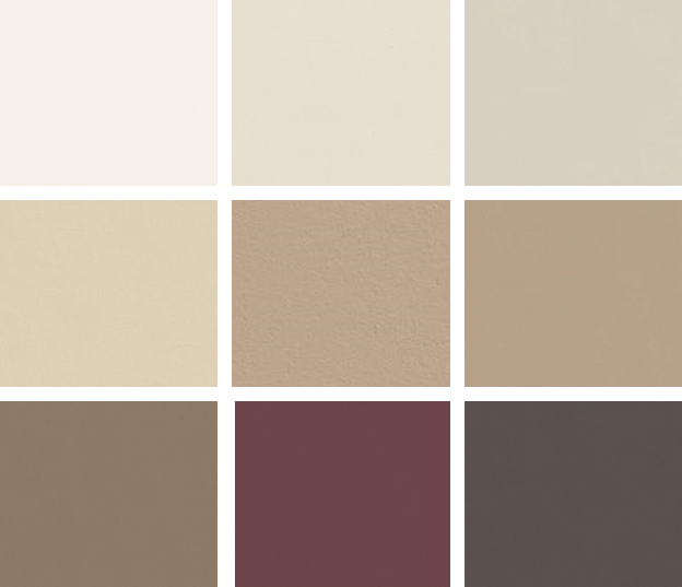
Neutrals are where undertones matter most, because they are where they are most often got wrong. Greys, whites, beiges and taupes all carry undertones that determine whether they feel warm or cool, and mixing the two accidentally is the most common colour mistake in homes.
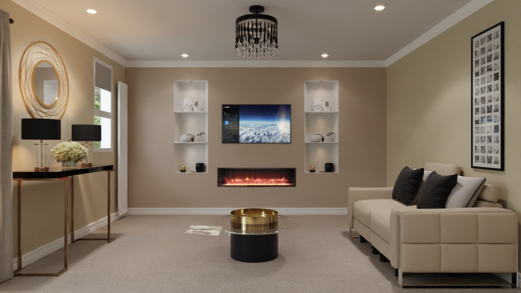
Warm neutrals have yellow, red or brown undertones. Think of a beige with a golden warmth, a greige leaning towards taupe, or a warm white with a hint of cream. These create a cosy, inviting feel and suit north-facing rooms, which receive cooler light and benefit from being warmed up.
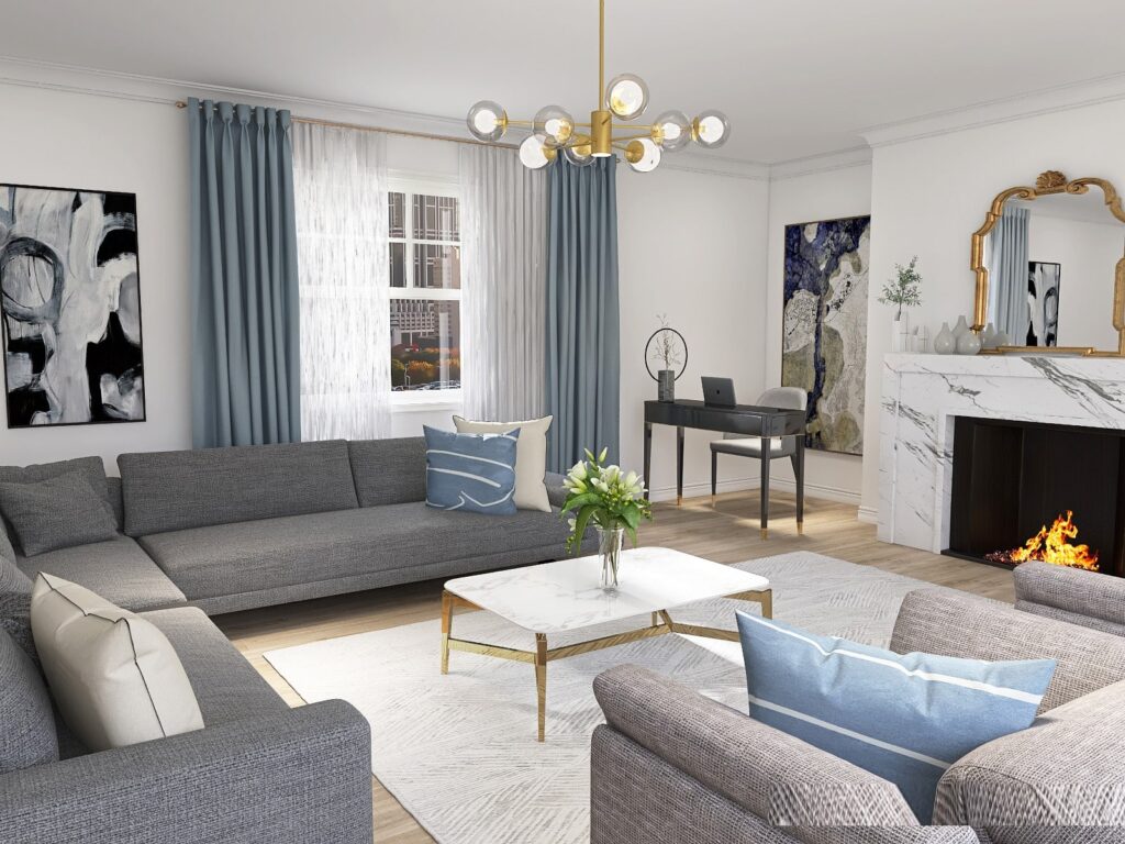
Cool neutrals have blue, green or violet undertones. A crisp grey, a bright white with a blue base, a greige leaning towards stone. These feel fresh and calm, and they suit south and west-facing rooms that receive plenty of warm natural light and can carry a cooler tone without feeling cold.
The key principle is to keep undertones consistent within a scheme. Warm neutrals sit happily with other warm neutrals, cool with cool. Mixing a warm cream trim with a cool blue-grey wall is where rooms start to feel subtly wrong, and it is worth checking undertones match before committing to a palette. A structure like the 60-30-10 colour rule helps hold the proportions in balance once the undertones are aligned.
Where to Use Warm Colours
Warm colours like red, orange and yellow are visually exciting and invigorating. They work well in social spaces such as the kitchen, dining room or living room, and they are especially good at making large rooms feel cosier and more intimate. Painting a large living room in a warm shade like caramel brown or rich gold draws the space in and makes it feel snug and welcoming.
If you want warmth without an overpowering effect, use accents and smaller elements instead, a warm red in furnishings or artwork, for example. Warm colours also pair naturally with north-facing rooms, where the cooler quality of light can leave cool colours feeling flat and grey. A warm undertone counteracts that and keeps the room feeling comfortable rather than chilly.
Where to Use Cool Colours
Cool colours like blues and greens have a calming effect and suit spaces meant for relaxation, such as the bedroom, bathroom or a quiet living room. They also tend to visually recede, which makes smaller rooms feel larger. A pastel blue or soft green can open up a compact room, one of the reliable ways to make a small space feel bigger.
Cool colours perform best in rooms with plenty of warm natural light, typically south and west-facing spaces, where the warmth of the daylight balances the coolness of the paint. In a north-facing room with little direct sun, a cool blue or grey can tip into feeling cold and unwelcoming, which is exactly where paying attention to undertone saves you from a colour that looks lovely in the tin and bleak on the wall.
Combining Warm and Cool Colours
The most interesting rooms usually balance both temperatures rather than committing entirely to one. The trick is doing it deliberately. Two principles help.
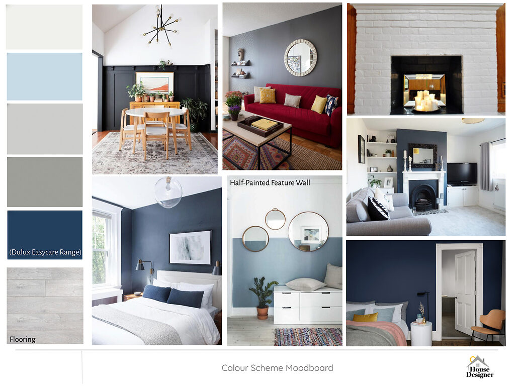
- Layer warm and cool tones – start with a base of one temperature and add accents in the other. A room with cool blue walls warmed up with orange or yellow accessories feels balanced and inviting rather than one-note.
- Use texture to bridge them – a plush, warm-toned rug in a cool room adds both visual and tactile warmth. Natural materials like wood, rattan and linen carry warm undertones that soften a cool scheme without needing a strong accent colour.
When you are choosing a whole palette rather than a single wall, avoiding the most common living room design mistakes, from playing it too safe to using dark tones without balance, matters as much as the colours themselves.
Create Your Ideal Space With House Designer
Choosing the right palette, and getting the undertones to work together, can feel overwhelming. Whether you are after an energising space or a calm retreat, our design team can help you strike the right balance between warm and cool so your home feels exactly as you intend.
Our online interior design services guide you through the whole process, colour, materials and layout together, and you can book a free consultation to talk your scheme through with a designer before you commit to a single tin of paint.