
Paint trends come and go quickly. Colour of the year announcements, social media aesthetics and magazine editorials all push homeowners towards shades that feel exciting in January and dated by the following spring. Timeless paint colours work differently. They are the shades that looked right twenty years ago, look right now, and will still look right when the next trend cycle has been and gone.
After working on hundreds of homes across the UK, these are the paint colours we find ourselves recommending again and again. Not because they are safe or boring, but because they genuinely hold up over time and work across a wide range of home styles, light conditions and furnishing palettes.
What Makes a Paint Colour Truly Timeless?

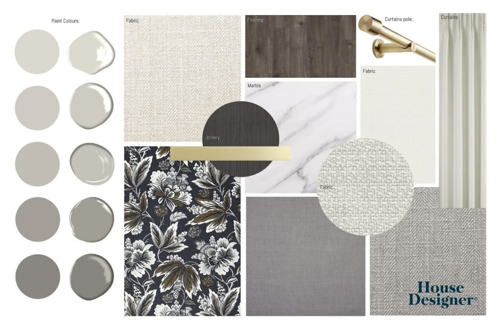
Image credit: House Designer®
A timeless paint colour is not simply a neutral. Some neutrals date badly, and some bolder colours have genuine longevity. What they share is complexity. Timeless shades tend to have depth and subtle undertones that shift with the light, which means they never look flat or one-dimensional. They also tend to work as a backdrop rather than competing with the room’s other elements.
The second quality is flexibility. A truly timeless colour can absorb different furniture styles, different accessories and different trends over the years without clashing. You can update a room around it rather than needing to repaint every time your taste evolves.
Warm Whites That Actually Work
White is the most misused colour in UK interiors. Pure, blue-based whites look clinical in most British homes because they clash with the cool, grey quality of natural light here. Warm whites with a hint of cream, pink or yellow in the base are the ones that stand the test of time.
Farrow and Ball All White is technically the cleanest white in their range, but it has just enough warmth to avoid feeling cold. It works particularly well on ceilings and woodwork paired with a warmer wall colour.
Little Greene Linen is a warm off-white with a soft golden undertone. It is one of the most versatile shades available for UK homes, working in north-facing rooms where cooler whites would feel stark and south-facing rooms where stronger colours can feel too intense.
Farrow and Ball Pointing sits in the warm cream territory, with enough warmth to feel inviting but enough restraint to read as white rather than yellow. It is particularly good in period properties and on joinery. We use it regularly in living room projects where the brief calls for something light but not clinical.
Designer tip: Test warm whites at A4 size minimum on your actual wall, not on a sample card. The colour you see on a small chip will look completely different at scale, particularly in artificial light.
The Warm Neutrals That Never Date
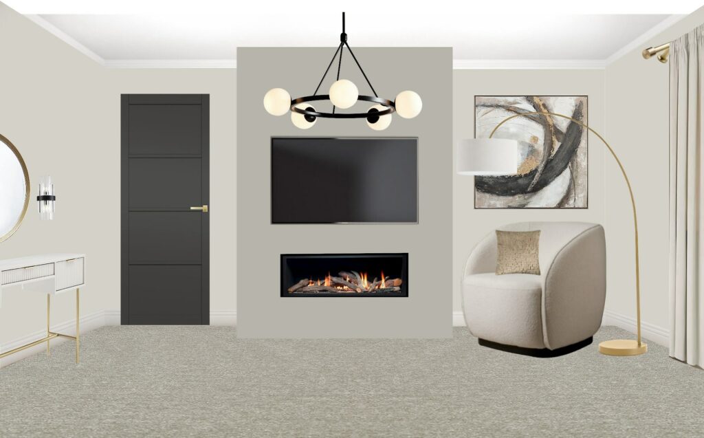
The grey-heavy palette that dominated UK interiors from roughly 2010 to 2020 has largely been replaced by warmer, more complex neutrals. These warmer shades have proven considerably more enduring because they work with natural light rather than against it, and they complement a much wider range of furniture tones.
Farrow and Ball Elephant’s Breath is one of the most reliably popular shades in the range for good reason. It reads as a warm grey-beige with a complex, slightly chalky quality that shifts beautifully through the day. It works in almost any room and is particularly effective in living rooms where you want something more interesting than a plain neutral without going bold.
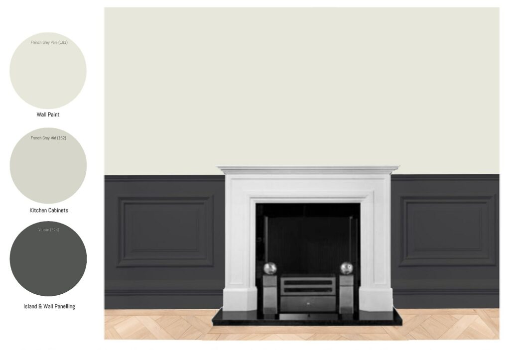
Little Greene French Grey is a softer, more clearly grey option that sits in the cool-warm middle ground. It has a refinement that suits period properties especially well, though it is equally at home in a more contemporary setting. The Light version works well in rooms where you want the grey presence without the depth.
Farrow and Ball Skimming Stone is a warm greige, the blend of grey and beige that gives you the best of both families. It reads slightly differently depending on the light conditions, which is part of what makes it so flexible. In a north-facing room it leans warmer. In a bright south-facing space it sits more clearly in the grey territory.
Designer tip: Warm neutrals need warm lighting to perform at their best. Cool LED bulbs strip the warmth out of these shades entirely. If you are painting in one of these colours and it is not looking right, check your bulb temperature before you reach for the paint chart. Our lighting design service covers this as part of every renovation project.
The Classic Deeper Colours Worth Committing To
Not every room needs to be neutral. Some of the most enduring interiors we have worked on have featured bolder colours used with enough confidence that they transcend the trend that initially inspired them. The key is choosing shades with genuine depth and complexity rather than the bright, saturated versions that tend to date quickly.
Farrow and Ball Hague Blue is one of the most requested shades we see on client mood boards, and it has been for years. It is a deep, complex navy with a green undertone that stops it from reading as flat or corporate. Used on all four walls in a dining room or home office, it creates an atmosphere that feels genuinely luxurious. It also works well on bedroom feature walls where the brief calls for something dramatic but not overwhelming.
Farrow and Ball Calke Green is a deep, slightly muted green that sits in the heritage palette without feeling dated. It has the quality of a colour that has always been there, which is exactly what you want from a shade you are committing a whole room to. It works particularly well in rooms with natural light and warm timber floors.
Little Greene Obsidian Green is a darker, more saturated option for those who want the full impact of a deep green scheme. Used with pale upholstery and warm brass hardware, it creates a scheme that is genuinely striking rather than simply dark.
Farrow and Ball Railings is an almost-black with a blue-green undertone that prevents it from reading as flat. It is one of the most versatile dark colours available, working on joinery and furniture as effectively as on walls.
Designer tip: Deep colours on all four walls work best in rooms with good natural light and well-planned artificial lighting. If you are unsure whether a deep colour will work in your specific room, test it on the wall opposite your main window first. That is where it will read at its darkest.
How Finish Changes Everything
The same colour in a matt finish and an eggshell finish can look almost like two different shades on the wall, and the finish you choose affects how the colour ages over time.
Matt and flat finishes absorb light and give colours their richest, most sophisticated quality. They are ideal for bedrooms and living rooms where you want depth rather than shine. The trade-off is that they mark more easily and are harder to wipe clean, so they are less practical in kitchens, bathrooms or children’s rooms.
Eggshell and satin finishes have a low sheen that makes them more durable and washable. They work well in high-traffic areas and on woodwork. For walls, an eggshell can sometimes make a colour look slightly lighter and less complex than the same colour in matt.
Modern emulsions from premium brands like Farrow and Ball, Little Greene and Lick are formulated with very low VOCs and water-based chemistry, which makes them more environmentally responsible and healthier to live with once dry. This is worth factoring in particularly if you are decorating bedrooms or children’s rooms where people spend significant time.
Building a Whole-Home Colour Palette

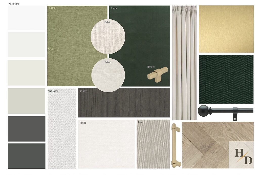
Image credit: House Designer®
Choosing individual colours room by room is the most common approach, and it is also the one most likely to leave you with a home that feels disjointed. A whole-home palette works from a single decision: choose a family of colours that share undertones, and use different shades within that family across different rooms.
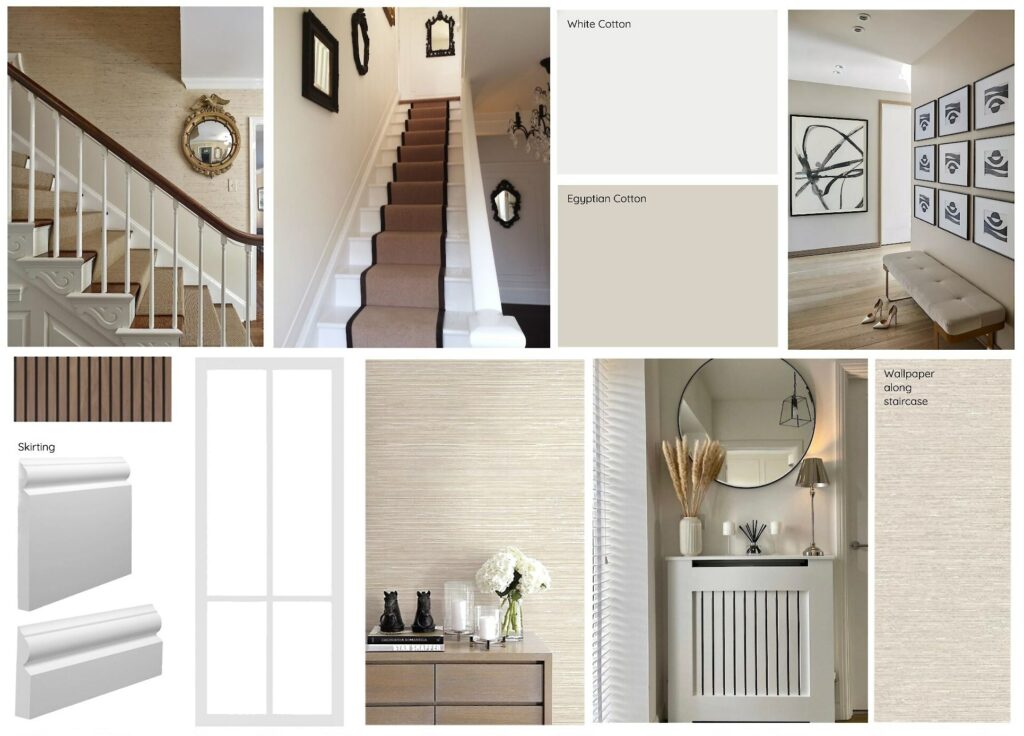
If your main living space uses a warm neutral like Elephant’s Breath, the rooms that connect to it should sit within the same warm family. A cooler grey in the adjacent hallway will feel disconnected. A deeper or lighter version of the same warm tone will feel intentional.
The colours used on joinery, skirtings and doors also do significant work in tying a whole-home palette together. Keeping all joinery in the same shade throughout the house creates visual continuity that makes even a varied room-by-room approach feel coherent.
Testing Before You Commit

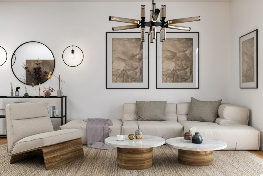
Image credit: House Designer®

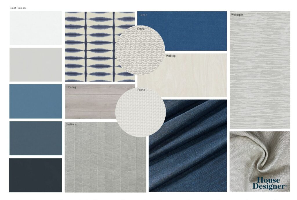
Image credit: House Designer®
This is the step most homeowners skip and most often regret. A small sample card tells you almost nothing useful about how a colour will perform on your walls. The same shade can look warm and inviting in a south-facing room and flat and cold in a north-facing one. It shifts with the time of day, with the season, and with the artificial lighting you have in the room.
Paint your chosen colours onto A3 or larger pieces of white card and move them around the room at different times of day. Observe them in morning light, afternoon light and under your evening artificial lighting. If a colour holds up across all three, it is a good choice for that room. If it only looks right at one time of day, it is telling you something important.
The psychology of colour in home design also plays a role worth understanding before you commit, particularly if you are decorating rooms where mood and atmosphere matter as much as aesthetics.
If you are approaching a wider renovation or a full repaint and want professional colour direction, our interior design packages include colour consultancy as part of the process. It is one of those decisions that is genuinely easier to get right with experienced eyes on your specific space. Book a free consultation with the team to talk it through.
About the author
Founder & Interior Designer
A trained interior designer with over 16 years of industry experience, Samantha-Jane founded House Designer in January 2020 after recognising that most homeowners wanted professional design guidance but found the traditional model too expensive, too slow, or simply out of reach. The studio she built is the first of its kind to cover interiors, gardens and exteriors under one roof.